KT Group Hope Sharing Foundation
KT Digital Talent Scholarship - Event Leaflet for PNU
Print, Leaflet, Catalog
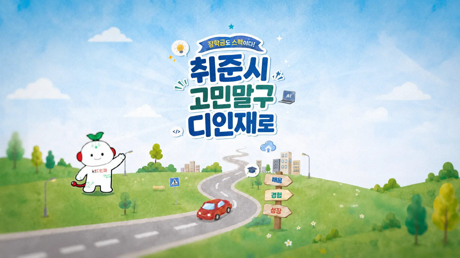
For the KT Digital Talent Scholarship program's meeting with Pusan National University students, we produced an event leaflet. We organized the scholarship program introduction, AI project experience, and AX-based social problem-solving activities so they could be understood at a glance, capturing the journey from learning to experience and growth through bright watercolor illustration and a roadmap format. We arranged the flow of information and visual elements so that on-site communication and program guidance would connect naturally. All illustrations were generated with AI, then refined to match the program's tone and visual identity before being integrated into the layout.
KT디지털인재장학생과 부산대학교 학생들의 만남을 위해 행사 리플렛을 제작했습니다. 장학프로그램 소개와 AI 프로젝트 경험, AX 기반 사회문제해결 활동을 한눈에 이해할 수 있도록 구성하고, 밝은 수채화 일러스트와 로드맵 형식을 통해 배움이 경험과 성장으로 이어지는 과정을 친근하게 담았습니다. 현장에서의 소통과 프로그램 안내가 자연스럽게 이어지도록 정보의 흐름과 시각 요소를 정리했습니다. 모든 일러스트는 AI로 생성한 후 프로그램의 톤과 시각 정체성에 맞게 정제하여 레이아웃에 통합했습니다.
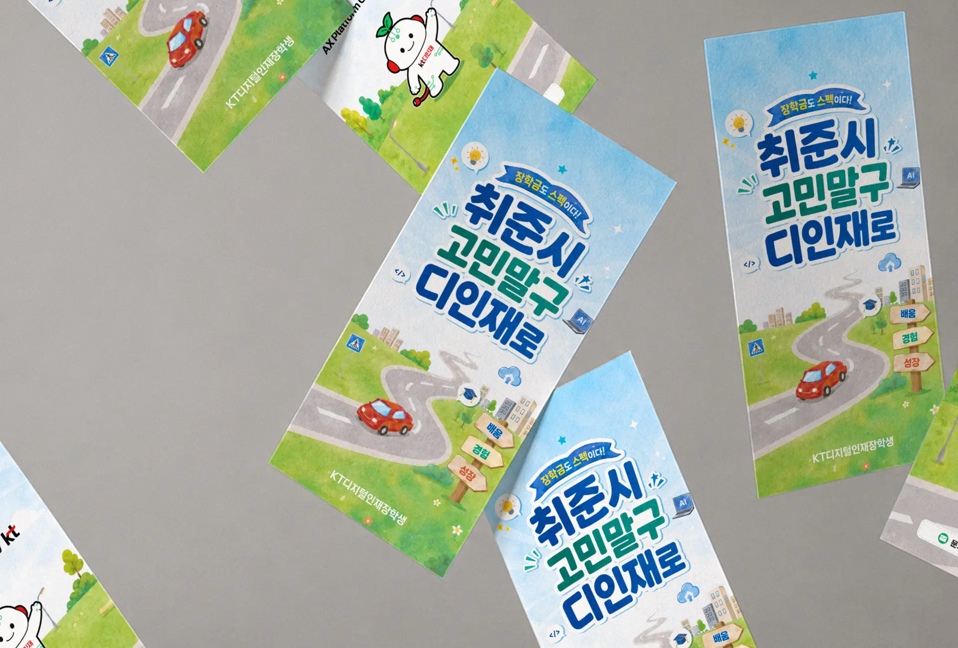
A scholarship program with multiple layers - eligibility, AI projects, networking, real-world outcomes - risks collapsing into a list. The challenge was to preserve the full scope without overwhelming a student encountering the program for the first time at a campus event. We reorganized the information hierarchy around a roadmap metaphor: participation milestones, project themes, and support structures were mapped onto a visual journey rather than a traditional brochure grid. The result is a leaflet that guides, not just informs.
장학 프로그램은 자격 요건, AI 프로젝트 참여, 네트워킹, 실제 서비스 연계까지 다층적인 정보를 담고 있습니다. 하지만 처음 마주하는 학생에게 그 모든 내용을 한 번에 전달하는 건 쉽지 않습니다. 우리는 정보를 나열하는 대신, 로드맵이라는 은유로 재구성했습니다. 참여의 흐름, 프로젝트 주제, 지원 구조를 도로 위의 여정으로 배치함으로써, 학생들이 이 프로그램의 방향과 가치를 직관적으로 따라갈 수 있도록 했습니다.
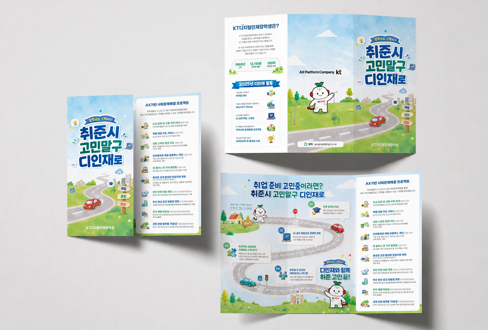

The central visual metaphor is a road - literally drawn as one. Career milestones, AI project categories, and scholarship benefits are arranged as waypoints along a hand-rendered route, rendered in soft watercolor tones that make the subject feel approachable rather than institutional. All illustrations across the leaflet were AI-generated, then selectively curated and refined to fit the program's warm, campus-facing identity. The character system and icon set were designed to function both as decorative elements on the cover and as informational anchors in the interior spread - the same visual vocabulary, doing different work on each surface.
핵심 시각 언어는 도로입니다. 장학금 지원, AI 실무 경험, 프로젝트 참여, 네트워킹으로 이어지는 흐름을 도로 위의 경유지로 배치했습니다. 부드러운 수채화 톤은 제도적 무게감을 덜어내고, 캠퍼스 현장에서 학생들에게 친근하게 다가갈 수 있도록 했습니다. 리플렛 전반의 일러스트는 AI로 생성한 후 프로그램의 정체성에 맞게 선별·정제했습니다. 표지의 캐릭터와 아이콘 세트는 장식 요소이자 정보 앵커로 동시에 기능하도록 설계했으며, 같은 시각 언어가 각 면에서 다른 역할을 수행합니다.
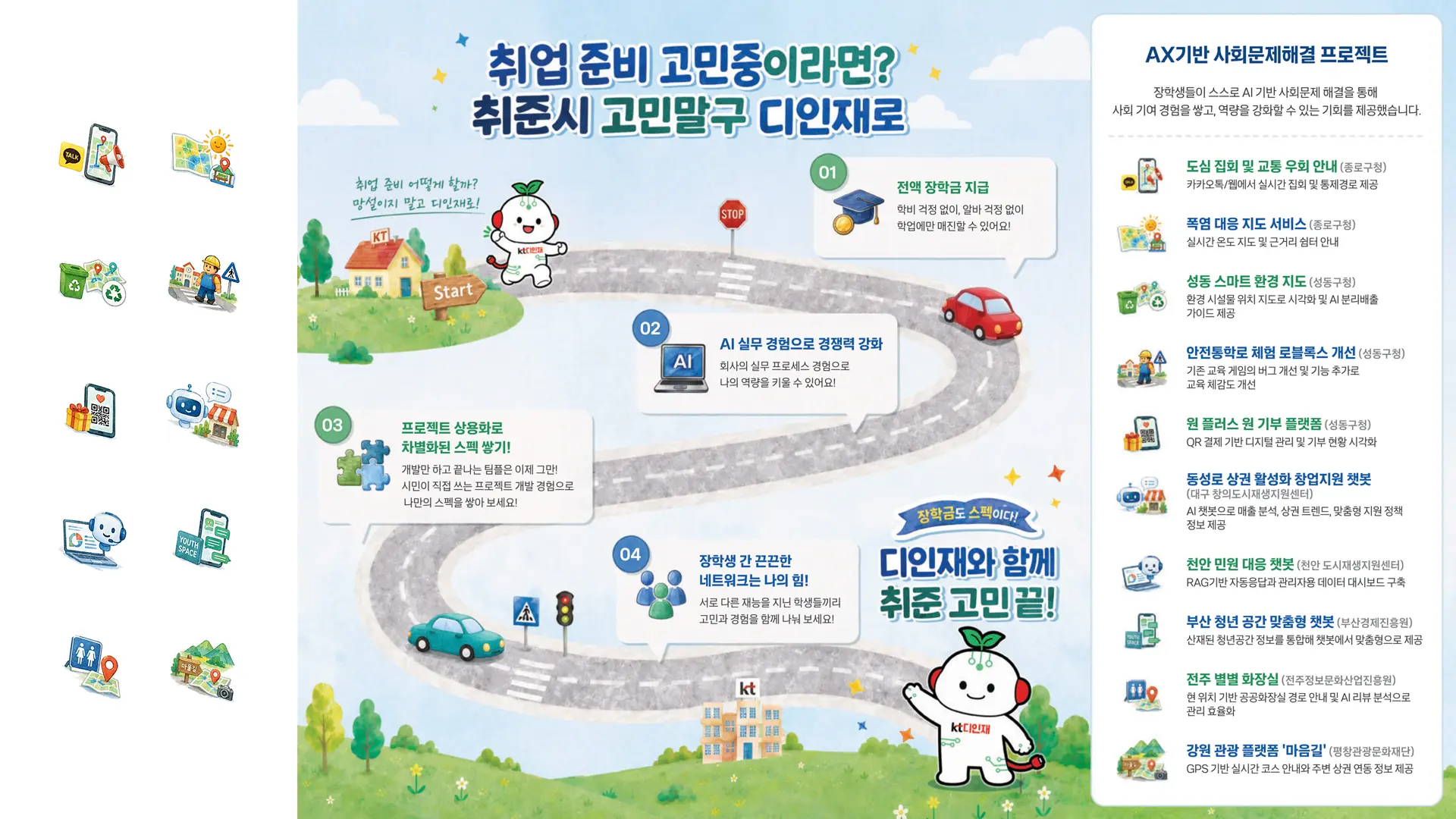
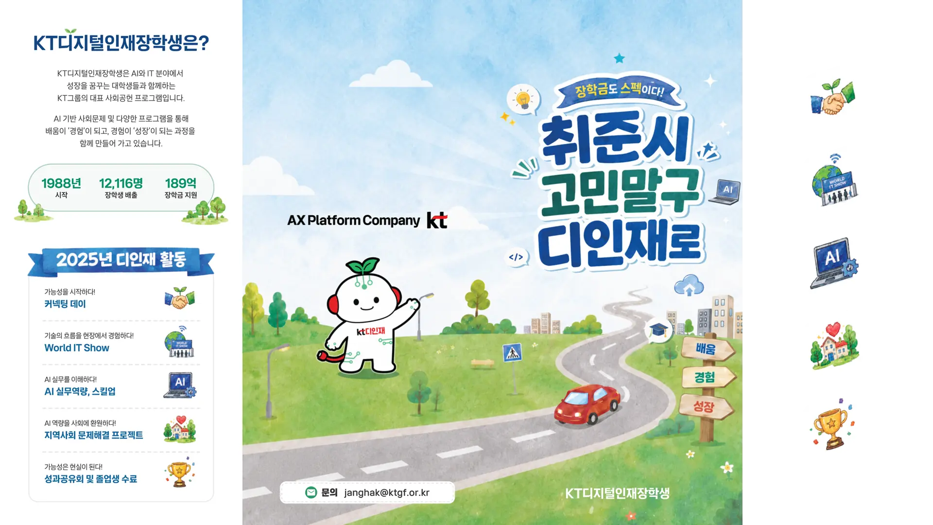
The full artwork for the three-panel folding leaflet (cover, interior spread, back information panel) and the icon set were produced to make the AX-based social problem-solving projects introduced at the event easy to understand at a glance. Topics such as transportation, heat islands, environment, chatbots, youth spaces, and tourism were each rendered in soft watercolor tones, conveying the process of AI technology becoming real-world service without feeling heavy or technical. Each project's character is made clearly distinguishable through small graphics alone. The set also functions as a guide element for the experience booths.
삼단 접지 리플렛(표지, 내지 스프레드, 후면 정보 페이지) 전체 아트워크와 아이콘 세트는 행사에서 소개된 AX 기반 사회문제해결 프로젝트를 쉽고 빠르게 이해할 수 있도록 제작되었습니다. 교통, 폭염, 환경, 챗봇, 청년 공간, 관광 등 다양한 주제를 부드러운 수채화 톤으로 표현해, AI 기술이 실제 서비스로 이어지는 과정을 부담 없이 전달합니다. 작은 그래픽만으로도 각 프로젝트의 성격이 뚜렷하게 구분되도록 했습니다. 체험 부스의 안내 요소로도 활용됩니다.

Print that moves with the person holding it. The leaflet was designed to work at three distances: as a visual invitation from across a booth, as a readable guide in hand, and as a reference to revisit after the event. Each panel was given a distinct role - attract, explain, confirm - so the reading experience unfolds naturally without needing instruction. Small in format, complete in scope.
손에 쥔 사람과 함께 움직이는 인쇄물을 목표로 했습니다. 부스 건너편에서 시선을 끄는 표지, 손에 들고 읽는 내지, 행사 후 다시 꺼내보는 후면 정보 페이지. 각 면은 유인-설명-확인이라는 명확한 역할을 부여받았고, 별도의 안내 없이도 읽는 흐름이 자연스럽게 이어지도록 설계했습니다. 작은 판형 안에 프로그램의 전체 여정을 담았습니다.