Seorin C&I
Authority, Structured
Print, Leaflet, Catalog
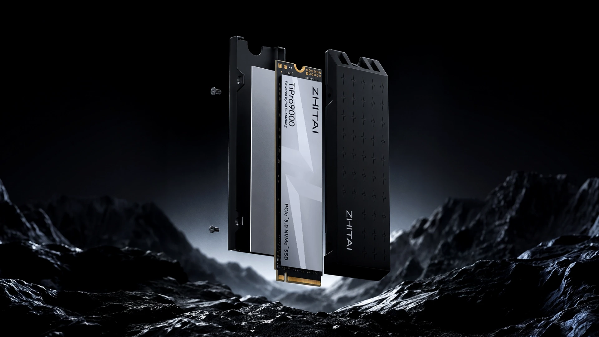
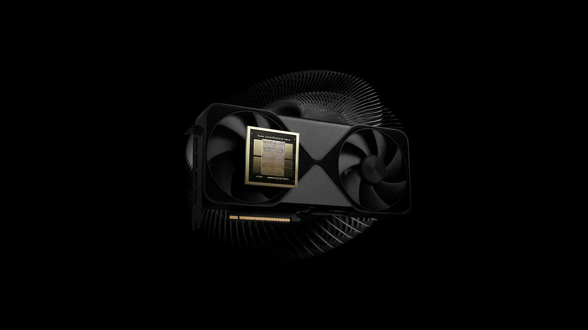
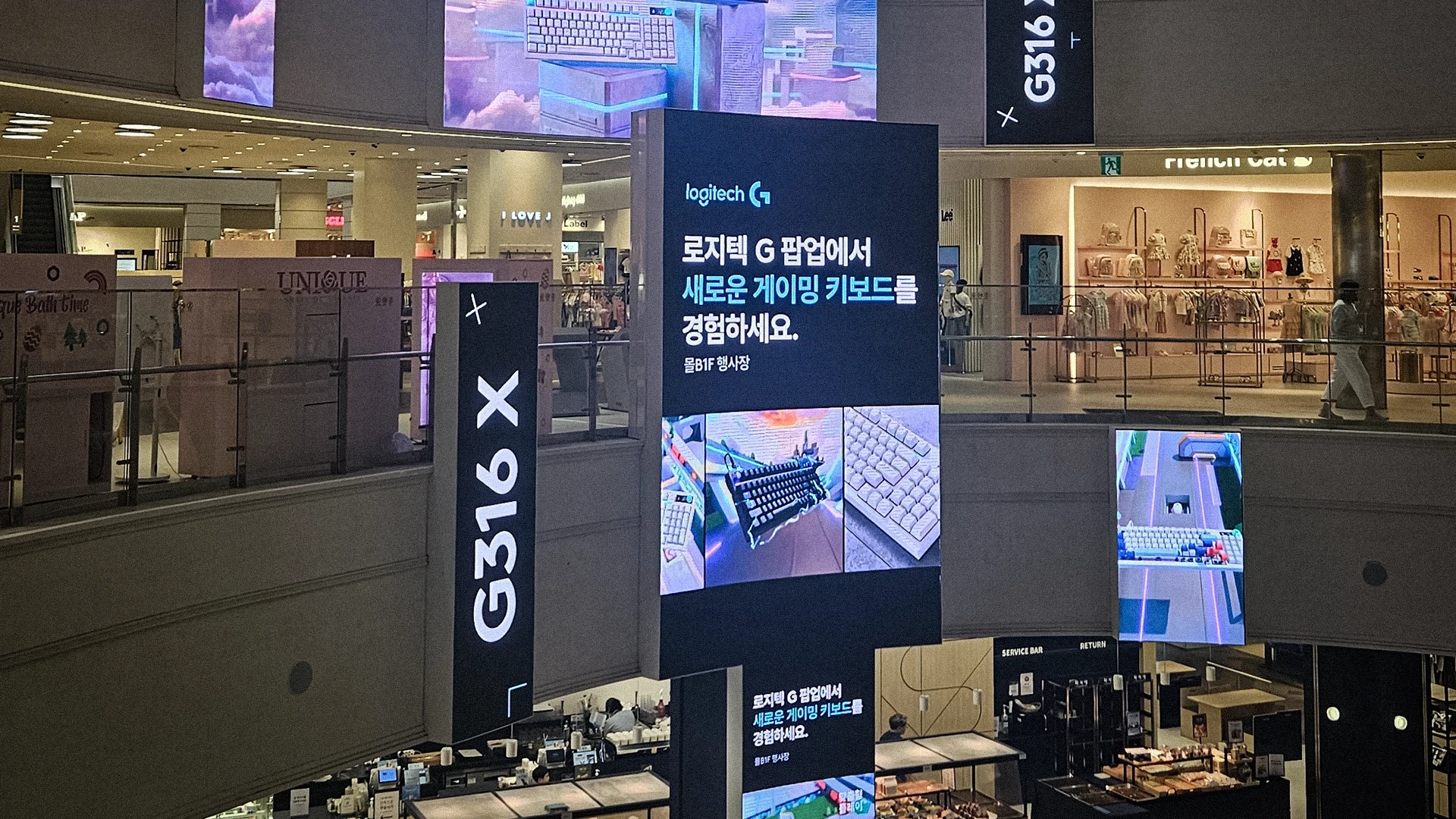
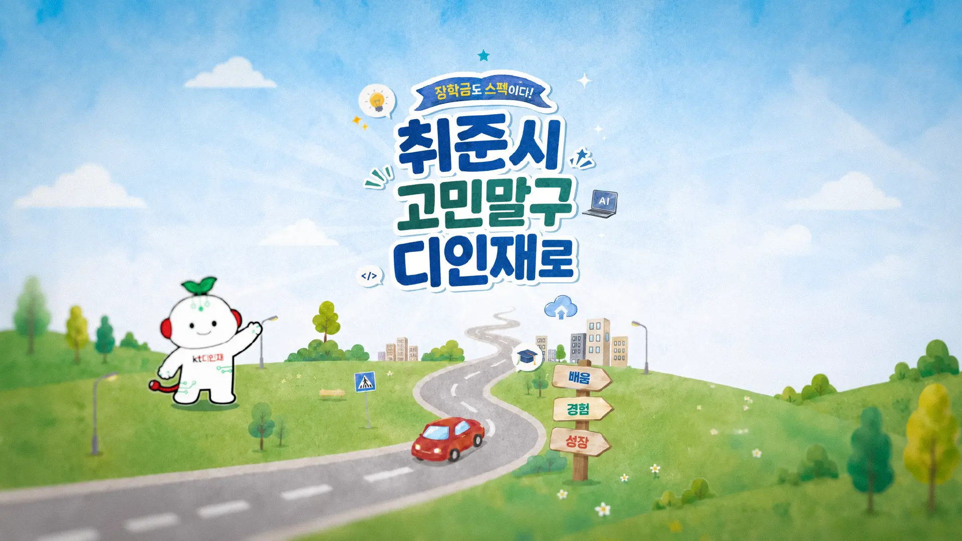
Seorin C&I is Korea's most trusted name in high-end PC hardware distribution - a company that has held the top position on Danawa for 10 consecutive years, managing a portfolio of 20+ global partner brands. Yet for a business operating at this scale, the company lacked a single document that could speak to the full weight of what it had built. We were asked to design a company introduction booklet that didn't just inform, but persuaded - one that could translate two decades of market leadership into a visual argument a B2B partner could read in under ten minutes and immediately understand why Seorin C&I sets the standard.
국내 하이엔드 PC 하드웨어 유통 시장을 지배하고 있는 서린씨앤아이는 20개 이상의 글로벌 파트너 브랜드를 운영하며 독자적인 유통 플랫폼과 브랜드 경험 설계 역량을 갖추고 있지만, 그 규모와 깊이를 단 하나의 문서로 전달할 수 있는 수단이 없었습니다. 우리는 단순한 회사 소개가 아닌, 국내/외 B2B 파트너가 10분 안에 읽고 신뢰를 결정할 수 있는 브랜드 제안서를 설계했습니다.

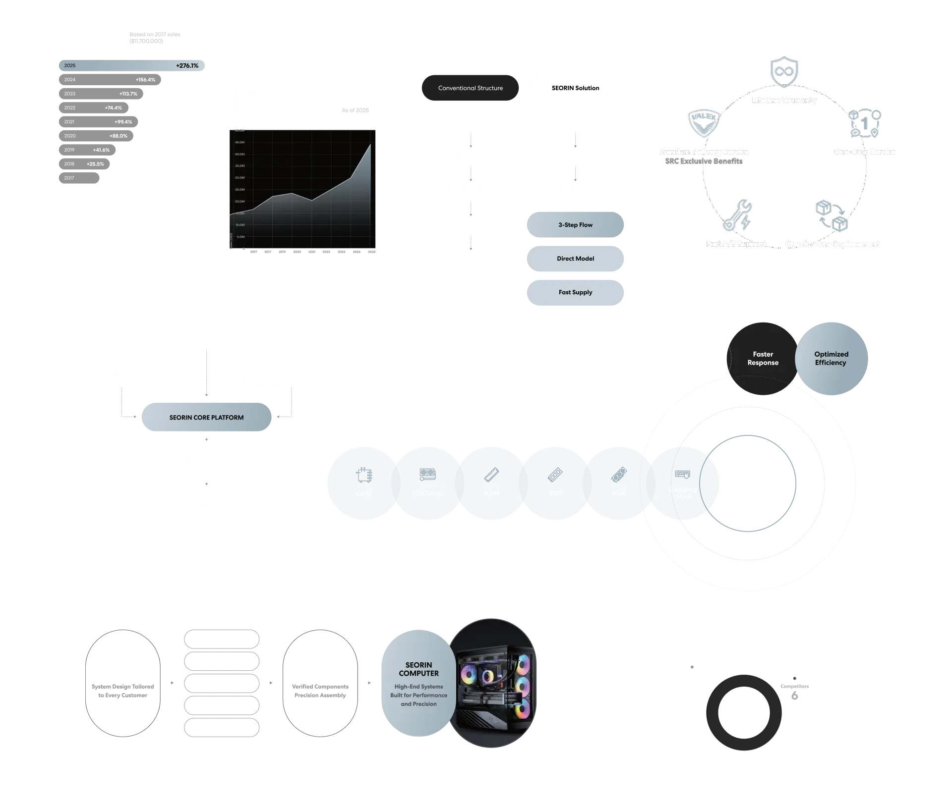
Most company introduction documents fail at the same point: they list what a company does, but never show why it matters. Seorin C&I had the data, the track record, and the partner ecosystem to make a compelling case - but that case needed a structure. The challenge was to organize 20 years of market activity into a narrative that moved from authority to vision, without losing the precision a high-end hardware audience expects.
대부분의 회사소개서는 같은 지점에서 실패합니다. 무엇을 하는지는 나열하지만, 왜 중요한지는 설명하지 못합니다. 서린씨앤아이는 충분한 데이터와 실적, 파트너 생태계를 갖추고 있었지만, 그것들을 하나의 설득 구조로 묶어줄 설계가 필요했습니다. 20년의 시장 활동을 권위에서 비전으로 이어지는 내러티브로 정리하는 것, 그것이 이 프로젝트의 핵심 과제였습니다.
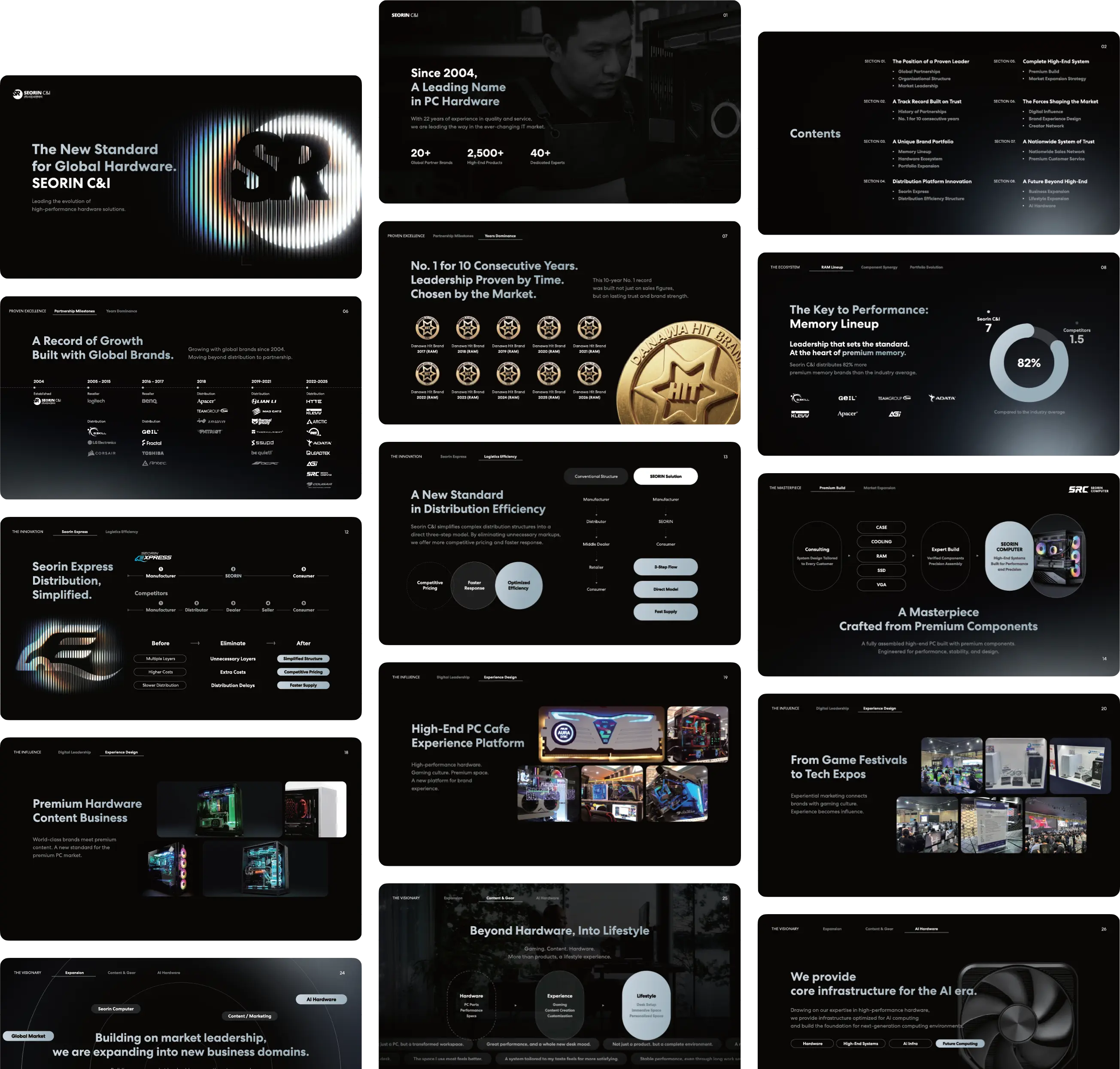
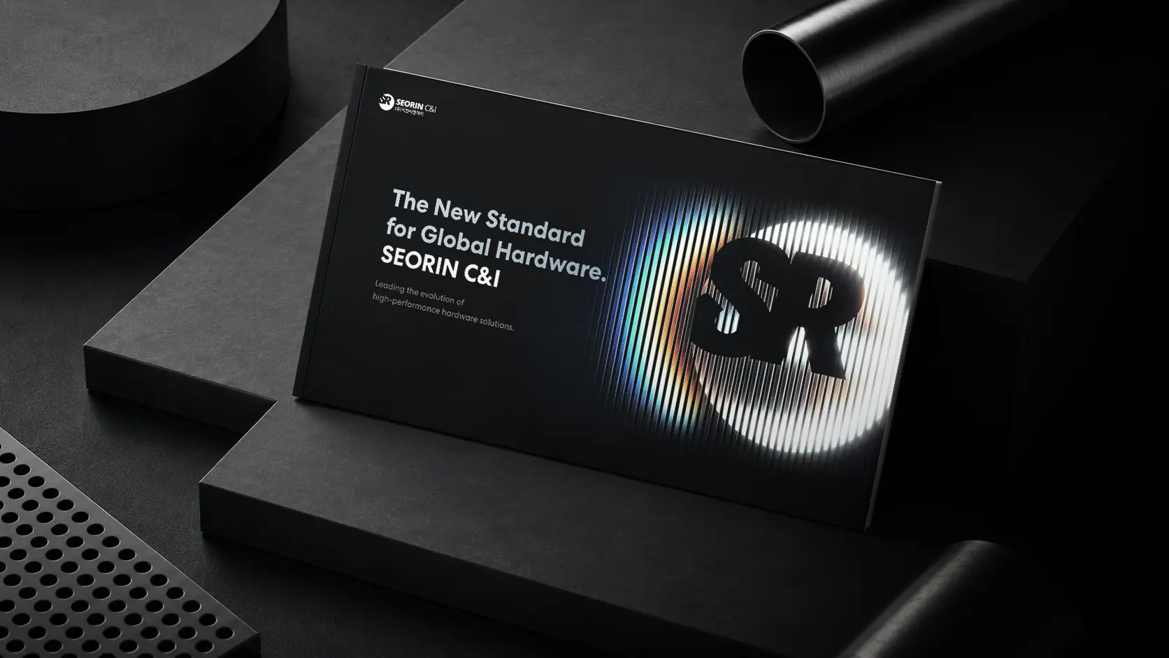
The document was structured around a single editorial logic: proof before promise. Each section builds on the last - from global partnerships and market dominance, through distribution innovation and brand experience design, to the company's expanding vision for AI hardware and lifestyle. The visual system mirrors this progression: dense data pages give way to atmospheric spreads, statistical precision softens into editorial texture. The iridescent SR monogram - rendered as light through lines - runs as a visual motif throughout, connecting the technical and the aspirational within a single design language.
전체 문서는 하나의 편집 논리로 구성했습니다. 약속보다 증거가 먼저 와야 한다는 원칙입니다. 글로벌 파트너십과 시장 지배력에서 시작해, 유통 혁신과 브랜드 경험 설계를 거쳐, AI 하드웨어와 라이프스타일로 확장되는 비전까지 - 각 섹션은 앞의 섹션 위에 쌓입니다. 비주얼 시스템도 이 흐름을 따릅니다. 데이터 중심의 밀도 높은 페이지가 점차 분위기 있는 스프레드로 전환되며, 빛의 스펙트럼으로 해석된 SR 모노그램이 시각적 모티프로 기술적 언어와 브랜드 열망을 하나로 연결합니다.

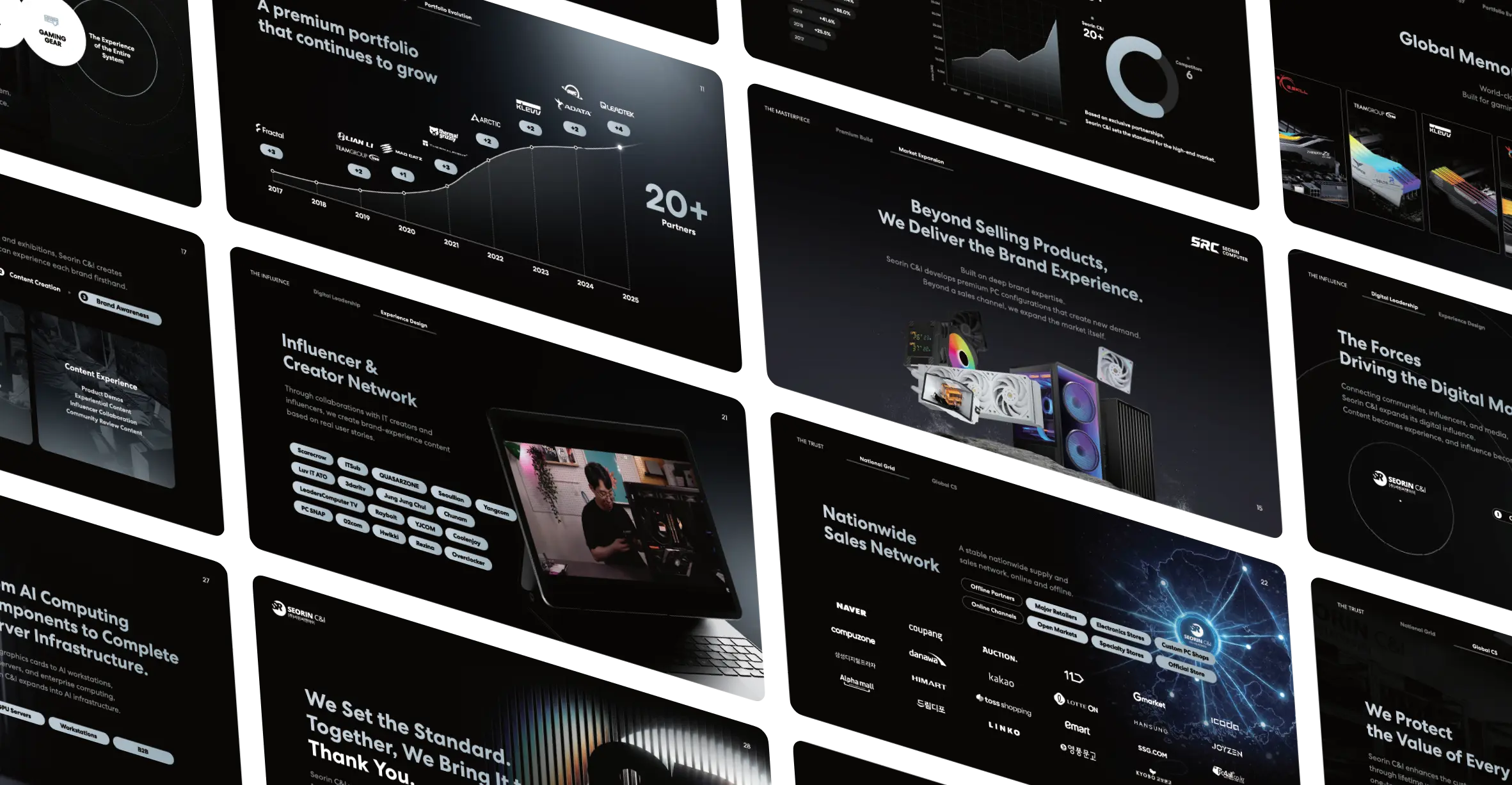
Full design of two versions of a 28-page company introduction booklet - one in Korean, one in English, covering 8 thematic sections: market authority, partnership track record, brand portfolio, distribution platform, complete system offering, market influence, nationwide trust network, and future vision. Deliverables include section architecture, layout system, data visualization design, infographic components, and cover identity - all developed as a unified visual language applicable across print and digital formats.
국문·영문 각각 28페이지, 총 2종의 회사소개서 전체 디자인을 납품했습니다. 시장 권위, 파트너십 실적, 브랜드 포트폴리오, 유통 플랫폼, 완성 시스템, 시장 영향력, 전국 신뢰 네트워크, 미래 비전의 8개 섹션으로 구성되며, 섹션 구조 설계, 레이아웃 시스템, 데이터 시각화, 인포그래픽 컴포넌트, 커버 아이덴티티를 포함한 통합 비주얼 언어로 제작했습니다. 인쇄 및 디지털 포맷 모두에 적용 가능한 확장형 시스템으로 설계되었습니다.
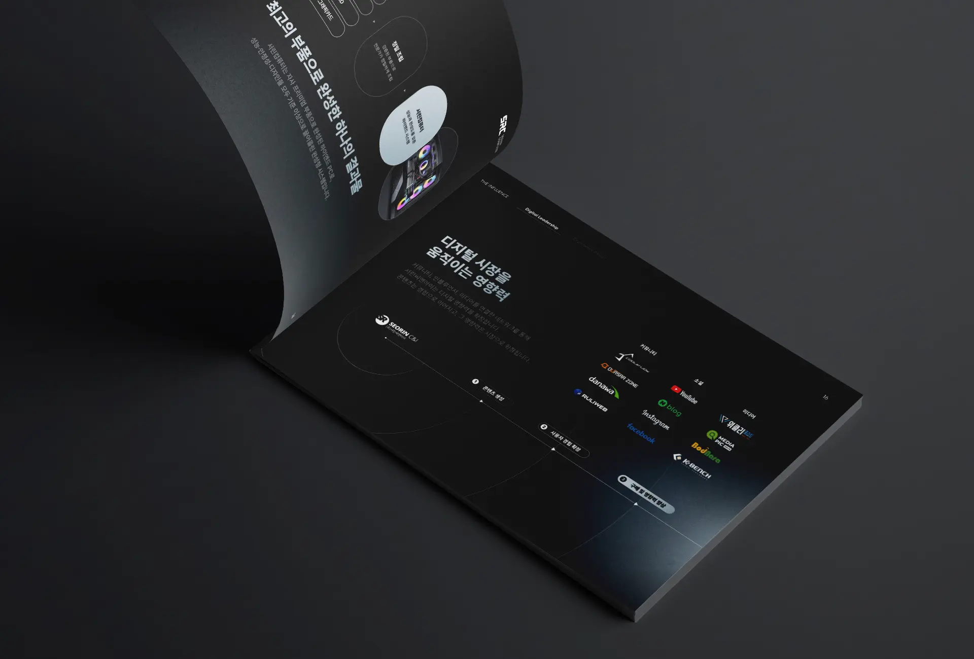
A company that has spent two decades earning trust deserves a document that carries that weight. Every layout decision, every data visualization, every typographic choice in this booklet was made with one question in mind: does this make the reader more certain? For Seorin C&I, the answer is now on every page.
20년간 쌓아온 신뢰는 그 무게를 담을 수 있는 형식이 필요합니다. 이 소개서의 모든 레이아웃, 모든 데이터 시각화, 모든 타이포그래피 선택은 하나의 질문 아래 이루어졌습니다. 이것이 읽는 사람을 더 확신하게 만드는가. 서린씨앤아이에 대한 답은 이제 모든 페이지에 담겨 있습니다.